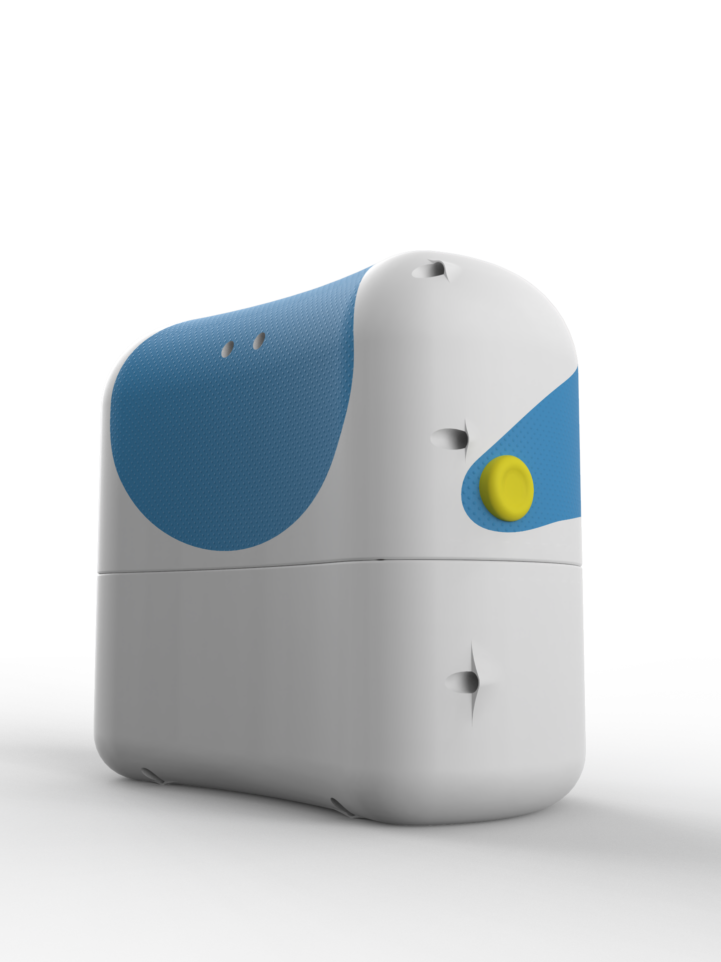
The above video demonstrates how the basketball stat collector works.
This map shows shot efficiency as orange intensity, the more intense the orange, the higher the shot percentage. Blue squares means that shots were taken from that location, but none were scored.
This map shows were each team got most of their points from. The greater the intensity of the yellow, the greater the number of the team's points were scored from that spot.
